Pre Press and Print Graphic Design
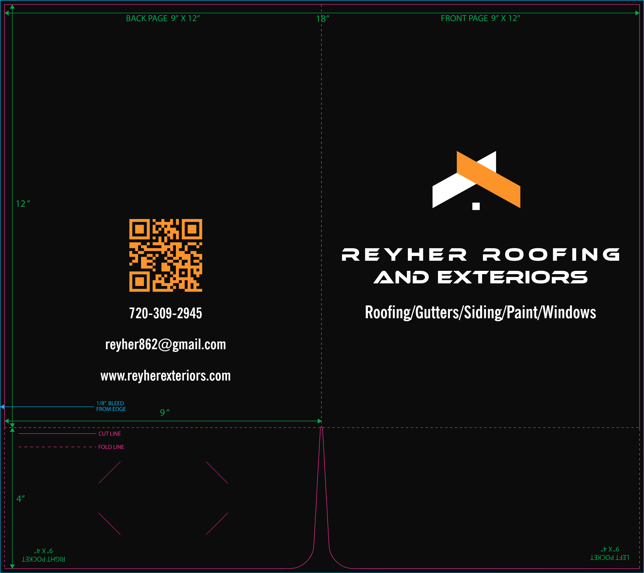
While working as a Freelance Pre-Press and Print Graphic Designer, I was tasked with various print projects, from making small changes to existing files to designing large projects from scratch. Pictured below is a simple design for a folder with business card cutout on the inside right pocket. The client, Reyher Roofing, requested their phone, email, and website on the back of the folder.
Updating Text and Adjusting Layout
It is quite common that a client will have a previous design they would like to reuse or replicate. For example, I modified Serra Trust Fund’s mailer, which was previous flattened, to work for this year’s event. I updated text, adjusted the size of elements, as well as adding new photos.
Pre-flighting and Preparing Digital Files
Many times clients will have a design they would like printed, however, the file is not properly setup. To start, I would simply check over the resolution, dimensions, colors, and overall file quality. One common issue that occurs is the dimensions are wrong, and the file needs to be resized for print. The file may or may not resize proportionally, but it is easily resized with Photoshop by adjusting the image size and canvas size. Some client files also have text placed very close to the edge/cut line, which needs to be moved away from the edge to avoid cutting through any text. I have worked with files that have improperly placed crop marks, which are easily removed in Photoshop. Some files had no bleed or crop marks at all. A standard 0.125 inch bleed can simply be added in Photoshop by increasing the canvas size, and replacing the blank space with various tools, which could include the clone stamp, content aware fill, or for complex images, generative fill. It is important to notate that in some instances, depending on the final material a design is printed on, generative fill would generate some tones one shade lighter than the original, which was noticeable on some prints.
Recreating Designs
Clients generally like to reuse designs from previous events. I recreated this flattened poster design (24” x 36”) in a large standing banner format (33” x 81”). I utilized Adobe Illustrator to create the editable file. Below, you can see the two different layout variations I created to transfer the design to the much larger format.
Designing Flyers
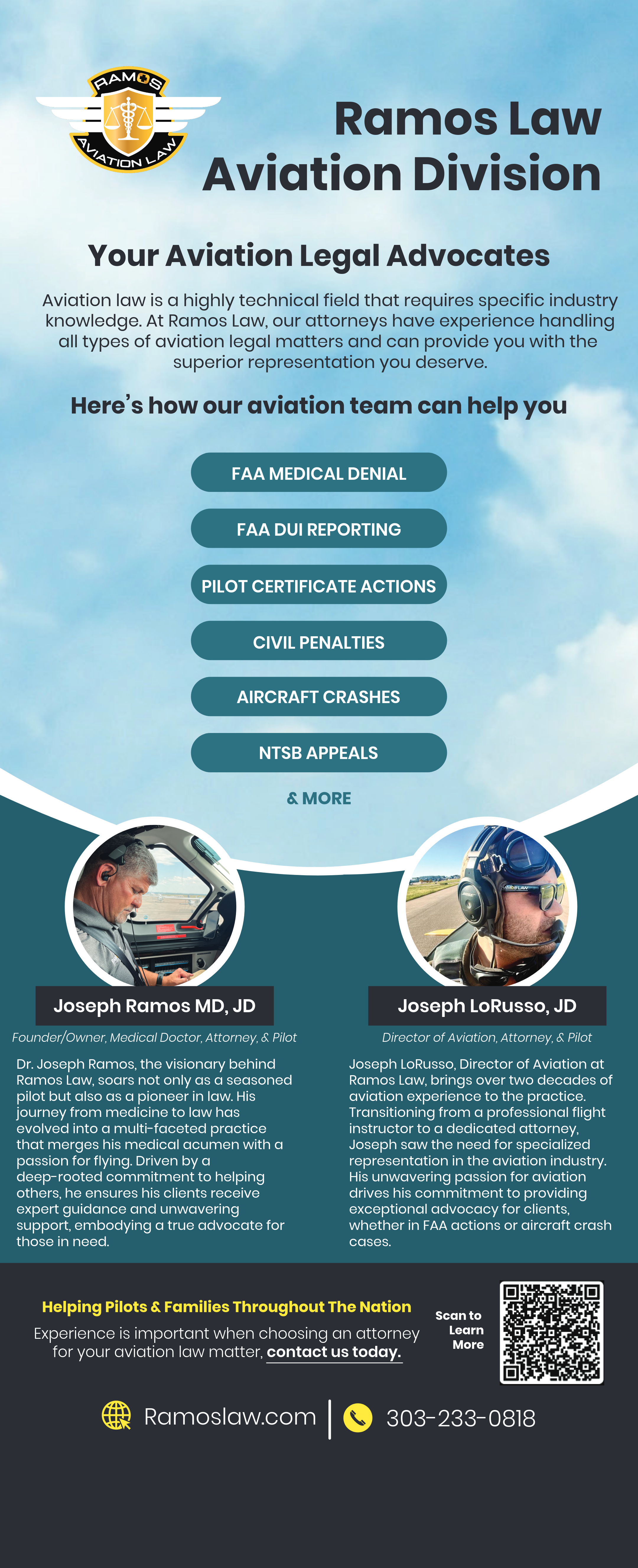
When designing flyers, it is important to establish a hierarchy in the typography, which makes information easier to digest for the reader. While working with AG Elite Cleaning Services, I took their established brand color palette, and expanded upon that with more, lighter shades of purple. This gave me the ability to combine their vector graphics and established characters with the text and information they wanted to convey in an effective and visually pleasing manner.
Designing Backdrops
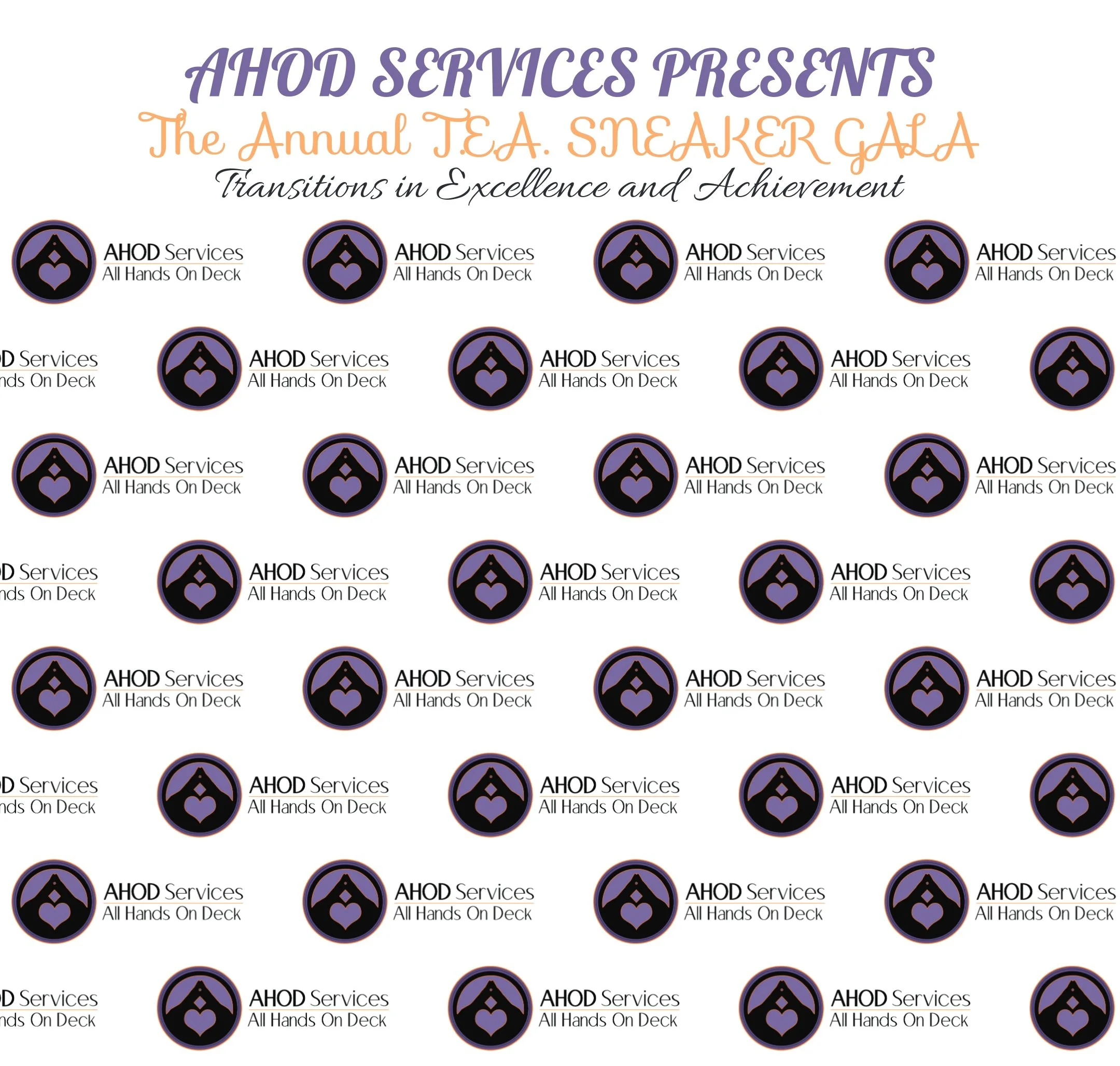
Large backdrops offer a nice visual presence at conferences and events. AHOD Service requested a 6’ X 6’ backdrop for an upcoming event they were participating in. I went with a simple step and repeat design.
Designing Standing Banners
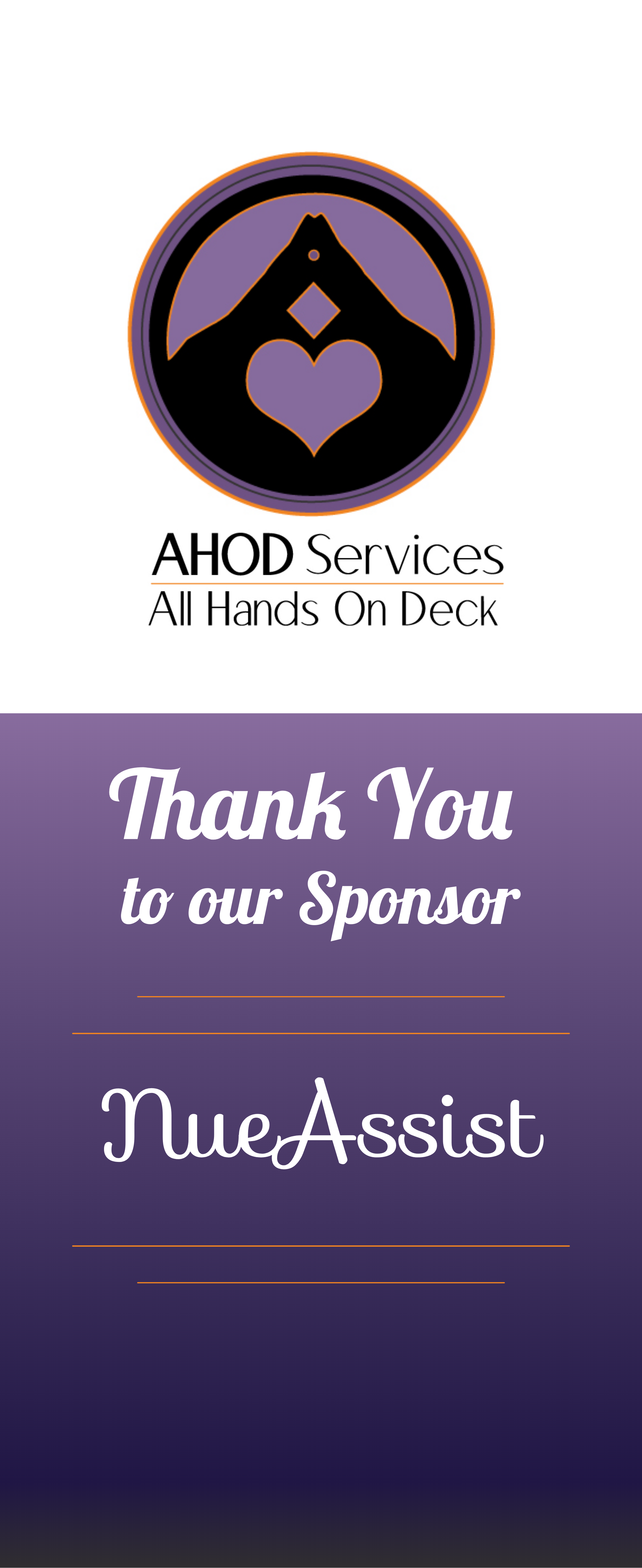
Designing banner stands are large format (33” X 81”) and are great for various purposes. It is important to notate that these files do not require a bleed, however, the top 3 inches and the bottom 3 inches need to be clear of any important information or graphics, as they can be covered by the stand which holds the banner. AHOD Services requested a standing banner to pair with their 6’ X 6’ backdrop. Below are the two different design variations I came up with. By combining large backdrops with additional standing banners, AHOD Services created a professional and impactful appearance to viewers walking past their booth.
Designing Flat Hanging Banners
Designing flat hanging banners is very similar to the standing banners, and the same large-scale design principals still apply. The only difference is the flat hanging banners have grommet holes going around the border, appearing every two feet. It is important to notate this, as you do not want anything important getting cut out by the grommet holes. The banners pictured below were three different design variations for KG Driving School to choose between. The final design was printed full size (8’ x 3’) and hangs inside of their classroom.
Designing Business Cards
Designing business cards from scratch requires an understanding of the client’s established brand identity, as well as any other ideas the client would like to implement, while maintaining professional design standards and offering my best advice and intuition on the design. It is also important to offer different design choices, which vary in appearance. I generally like to offer a vector design and a raster design, just to get a feel for what kind of design styles each client prefers.
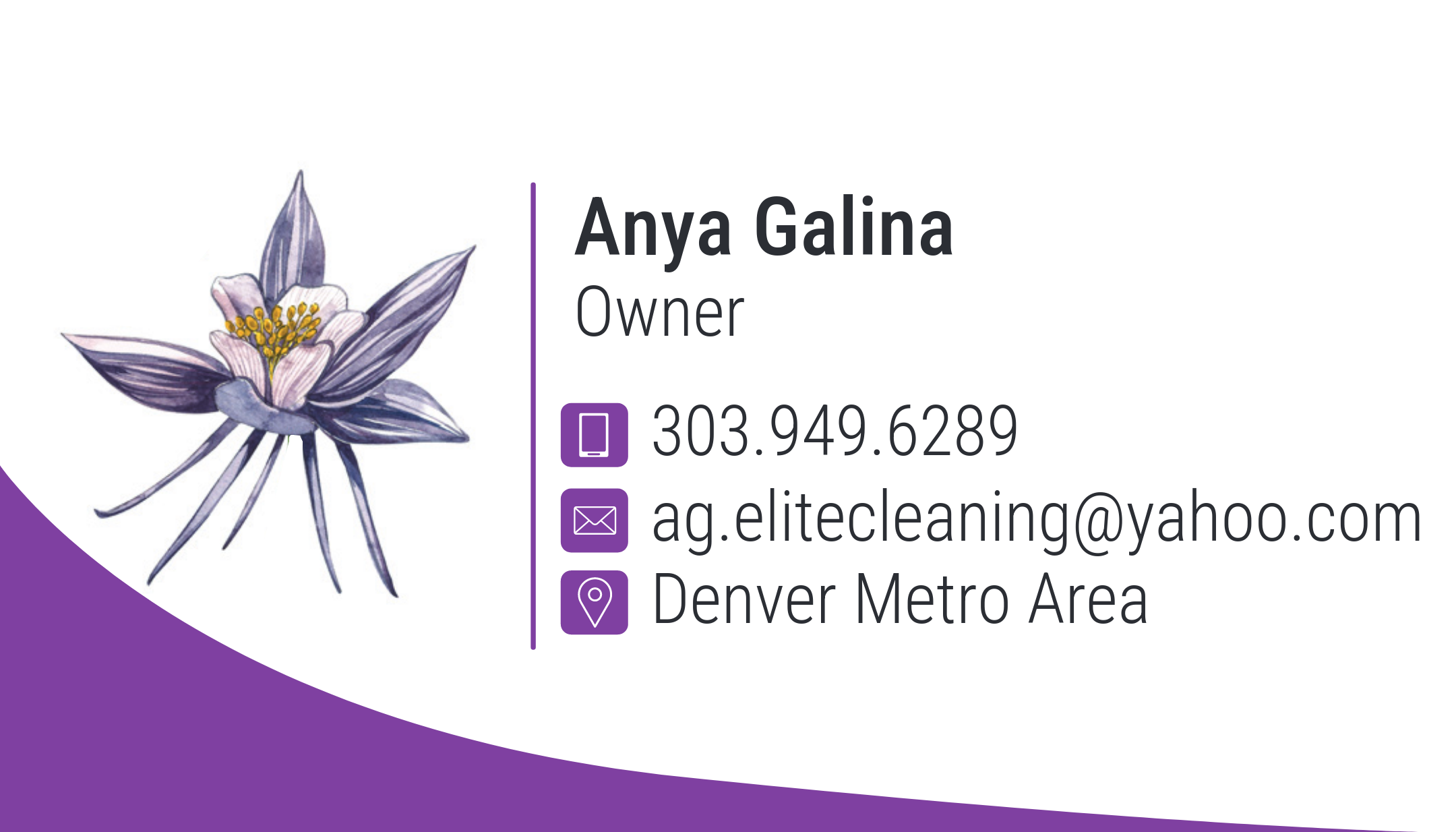
While working on a business card re-design for AG Elite Cleaning Services, a local cleaning business, I created three design variations inspired by their old business card design. The three different flowers were provided by the company. I also re-used their established color palette. The client and I both agreed that the rightmost design was the most successful.
Sometimes clients request small changes to existing business cards, such as updating a phone number, email address, job title, etc. These changes can be made regardless if the client has a working file or a flattened file.
There are instances, however, when it makes sense to create a working file rather than working with a flattened file. Megastar Realty, for example, had a flattened business card .jpg file that they wanted to use to make business cards for newly hired employees. I used their .jpg file to recreate the design as an editable adobe Illustrator file so I could easily create consistent business cards for both old and new employees. As I was showing the client how editable the new working file was, they had wanted to make some additional changes that they now knew were possible. For example, I updated their logo, changed the shade of red, the address, as well as the photo.
Designing Vehicle Magnets
A1 RV & Auto Detailing is a local detailing service in the Denver Metro Area. I worked with them to create promotional items to help attract more business. We decided vehicle magnets would be one successful form of marketing.
To create this design, I utilized their existing brand elements including the chain background as well as the red and orange swooshes. Combining those design elements with matching typefaces and their logo creates consistency, which contribute to the company’s professional appearance .

